IndusInd Bank Merchant App
The visual design and brand-aligned UI system for IndusInd Bank's merchant banking app, built end-to-end across every journey.
Project overview
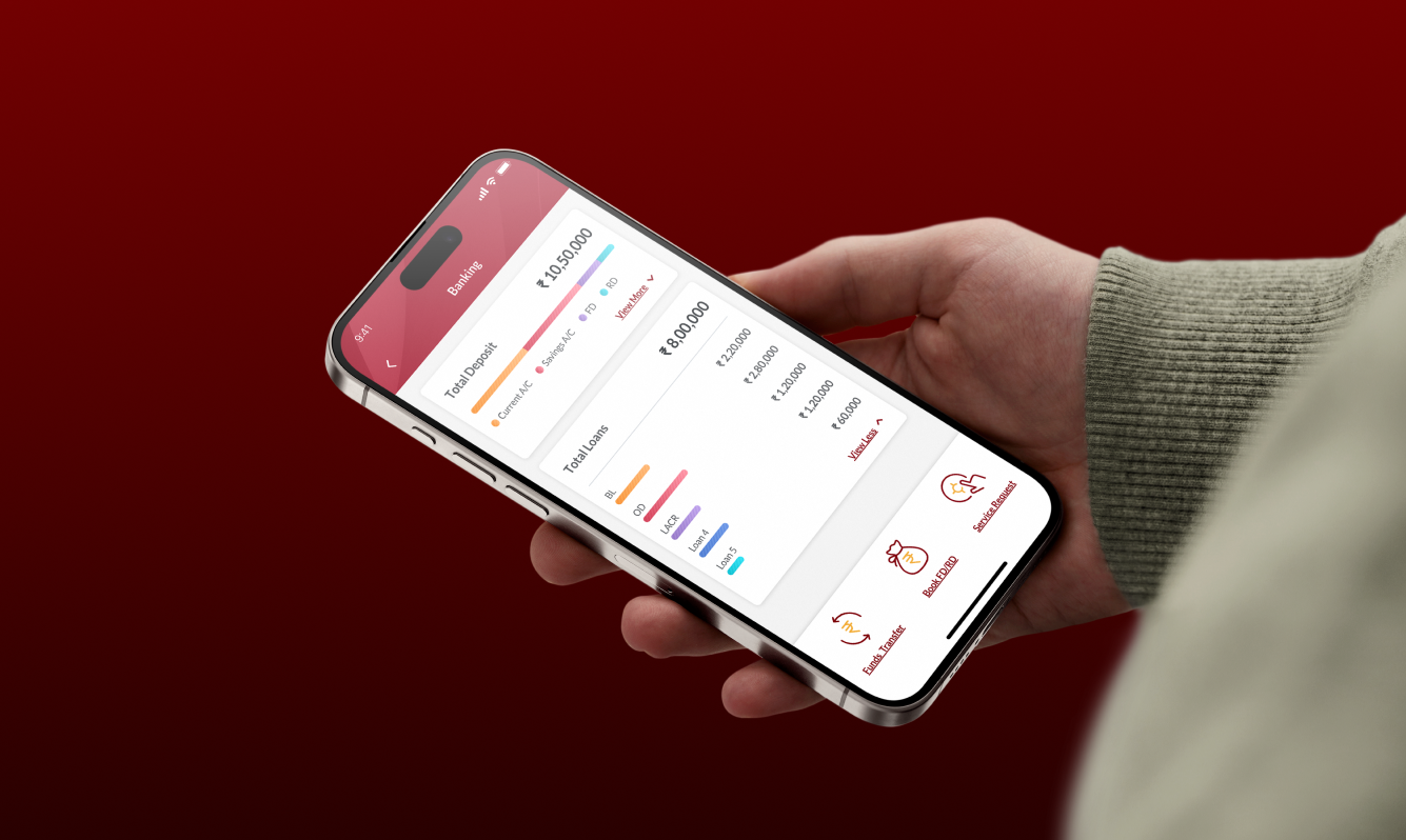
IndusInd Bank wanted to bring its merchant banking services into a dedicated mobile app: a single place for small business owners and merchants to manage deposits, card services, fund transfers, and their earnings dashboard. The product team had defined the structure and built wireframes. What was needed was a complete visual layer that would carry the brand into a modern banking experience and hold up consistently across every flow in the app.
I joined the project as the visual designer, owning the visual system end to end. My remit was to translate wireframes into high-fidelity UI, identify and close gaps where the wireframes diverged from a coherent design system, and shape a refreshed look that felt unmistakably IndusInd while standing up to modern banking expectations.
The context
Two things made this project distinctive from a visual standpoint.
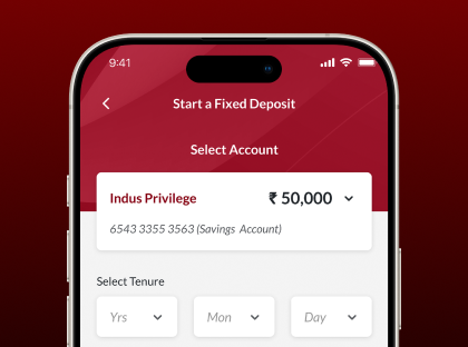
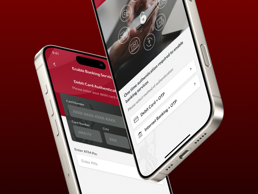
First, the scope was broad. Merchant banking apps are dense by nature, fixed deposits, recurring deposits, card services, fund transfers, payment management, an earnings dashboard, and dozens of smaller flows around onboarding, KYC, settings, and support. The visual system had to scale across all of it without feeling repetitive or breaking apart at the edges.
Second, IndusInd's brand needed to come through clearly. The existing visual references inside the bank were strong on identity but had been built primarily for marketing surfaces, not transactional product use. Translating that identity into something that worked at app-density, where users would be reading numbers, comparing options, and confirming transactions, required interpretation rather than direct application.
The work
The work split across four focused areas, each shaping a different layer of how the app felt and behaved.
A refreshed visual language
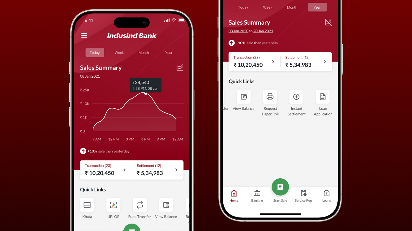
The first job was establishing the type scale, colour system, spacing rhythm, and component patterns that would carry the brand across the entire app. The result was a tighter, more functional system than the existing brand surfaces had used: cleaner type hierarchy, a focused colour palette anchored by IndusInd's primary brand colours, and component styling tuned for clarity rather than decoration.
What got cut mattered as much as what stayed. Heavy gradients, oversized headers, and ornamental treatments were pulled back in favour of patterns that supported quick scanning of balances, transaction lists, and product offerings.
A new icon library
Existing iconography didn't cover the breadth of merchant journeys. I designed a new icon set from the ground up: deposits, card services, transfers, transaction states, notification types, navigation elements, and dozens of smaller utility icons. Each was drawn to a consistent stroke and grid so the entire system would feel like one product, not a collection of stock icons.
Visual coverage across every journey
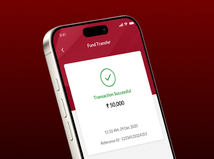
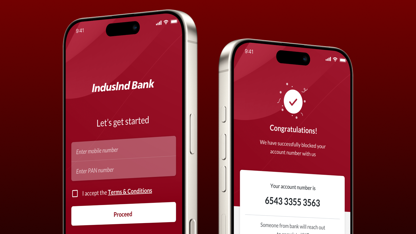
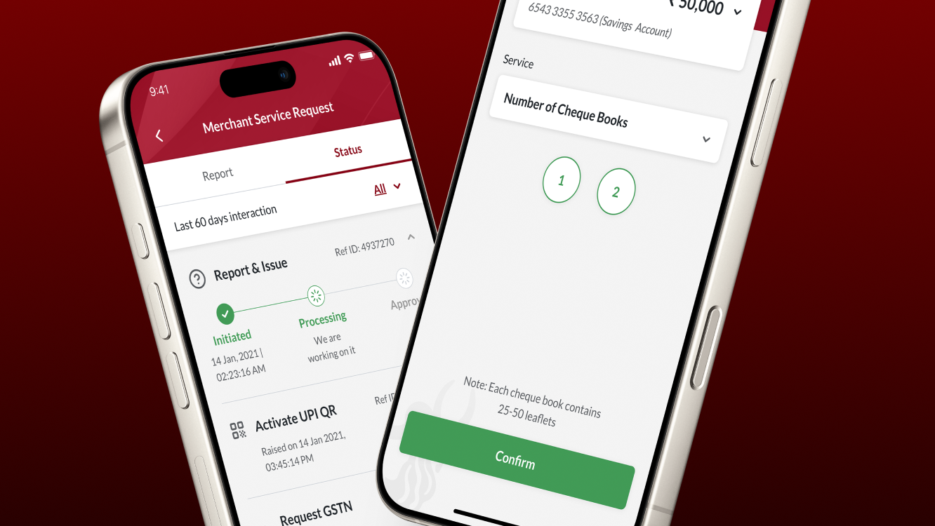
The wireframes covered the structural intent of the app. My job was to take every screen across every journey, FD/RD setup, card management, transfer flows, dashboard views, onboarding, settings, support, and bring it to high-fidelity production-ready UI.
Along the way, I identified gaps where the wireframes didn't fully account for the visual system's needs, missing states, unclear hierarchy decisions, components that needed variants, and worked back with the product team to close them. For several journeys, I pushed the visual treatment a step further than the wireframes had specified, exploring more refined patterns that the team adopted into the final build.
Dev-ready handoff
Every screen, component, and asset was prepared for engineering with clear specifications, naming conventions, and exported assets. The icon library, type system, and component patterns were documented so the engineering team could build against a consistent visual baseline rather than re-deriving decisions per screen.
Outcome
The Indus Merchant Solutions app shipped in 2022 and went into production for IndusInd's merchant customers across India. The visual work was visible enough that the bank used the launch imagery across its official communications, including their verified public channels.
In the years since, IndusInd has continued investing in the product. The merchant app has evolved into INDIE for Business, the bank's broader business banking platform, with updated styles and structure reflecting new product requirements. That kind of continued evolution from the original release is the outcome most worth pointing to: the visual foundation was strong enough to be a starting point for what came next, rather than a one-off launch.
Reference: [Original 2022 launch coverage on IndusInd Bank's verified Facebook page]
View Link
Project gallery