Prepaid Flexi Revamp
Redesigning du's one of the most popular prepaid product to be transparent, customisable, and conversion-led.
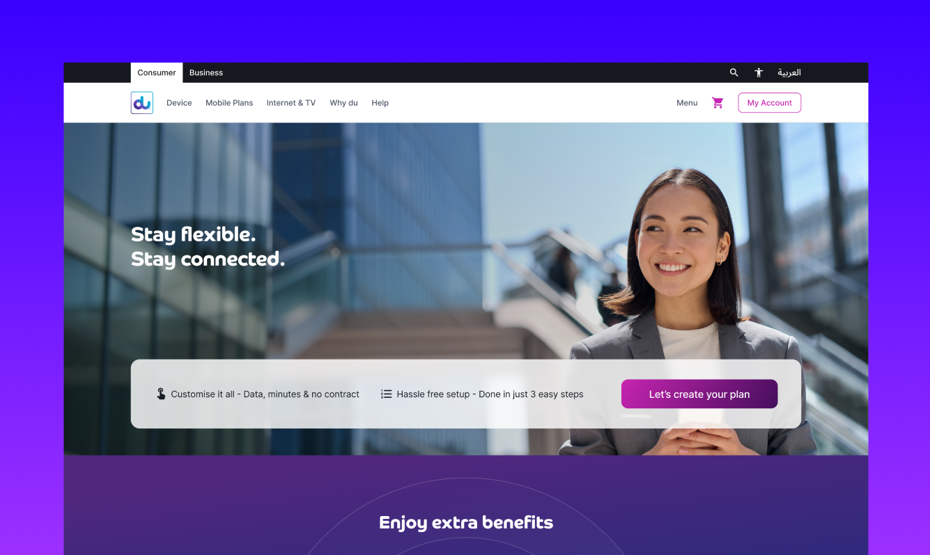
Project overview
Flexi Plan is one of du's flagship prepaid products in the UAE, allowing customers to build a custom mobile plan from data, voice, and international minutes. The existing experience suffered from low online conversion, dense pricing presentation, and a journey that didn't reflect how different user types actually shopped.
The brief was straightforward in ambition and broad in scope: revamp the entire Flexi experience to be more transparent, customisable, and user-friendly, while increasing online conversions and reducing dependency on physical stores. Targets included raising online conversion to at least 70%, boosting eSIM adoption, and modernising the journey from first visit to purchase.
I led the design end-to-end across web and mobile, from research through to shipped product, partnering with product, engineering, and marketing throughout.
The problem
Three things were holding the existing experience back.
First, the page was dense. Heatmap analysis showed users were dropping off before they understood what they were actually buying. The pricing structure, while honest, wasn't immediately legible.
Second, the journey assumed one type of buyer. Quick promo-driven users and informed comparison shoppers were being funnelled through the same flow, which served neither well.
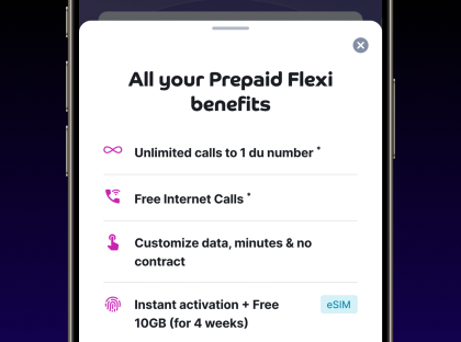
Third, the value of buying online (50% off yearly, instant eSIM activation, special numbers) was buried below the fold, doing none of the work it should have.
The opportunity was clear: there wasn't one journey to optimise, there were several, and the redesign needed to support each without fragmenting the experience.
Research ideology
The brief gave me business goals. Research gave me the why behind user behaviour.
I analysed production heatmaps from both web and mobile to see where attention actually landed (and didn't). Two patterns stood out: the plan customisation block got intense engagement, but the pricing breakdown and online-only benefits were largely ignored. On mobile, the entire above-the-fold space was working, but engagement fell off sharply once users hit the "Even more benefits" section.
I ran a questionnaire across 60+ prepaid users covering demographics, decision-making criteria, eSIM awareness, and post-purchase expectations. The clearest signal: 78% of respondents wanted to see total cost before completing purchase, and 64% had abandoned a plan purchase online before, mostly due to confusing pricing or fear of hidden charges.
I also benchmarked competitors, with Virgin Mobile UAE as the primary anchor. Their journey emphasised simplicity but lost depth for power users who wanted to customise. The redesign needed to do both.
Three directions, one decision
I explored three distinct directions before committing to one.
Direction 1 - Build my own
Control-focused. A guided plan builder with sliders and toggles for data, voice, and international minutes, with real-time pricing.
Direction 2 - Max value
Discount-focused. Lead with the strongest online-only offers (50% off yearly, bonus GBs, special numbers), with customisation secondary.
Direction 3 - Standard plans
Bundle-focused. Pre-built plans for different user types (Student, Professional, Tourist), with customisation available but not the default.
Each direction had merit. Build my own served informed users beautifully but overwhelmed quick buyers. Max value drove urgency but felt pushy and undercut the trust we were trying to build. Standard plans were the safest, but the safest was also the most forgettable.
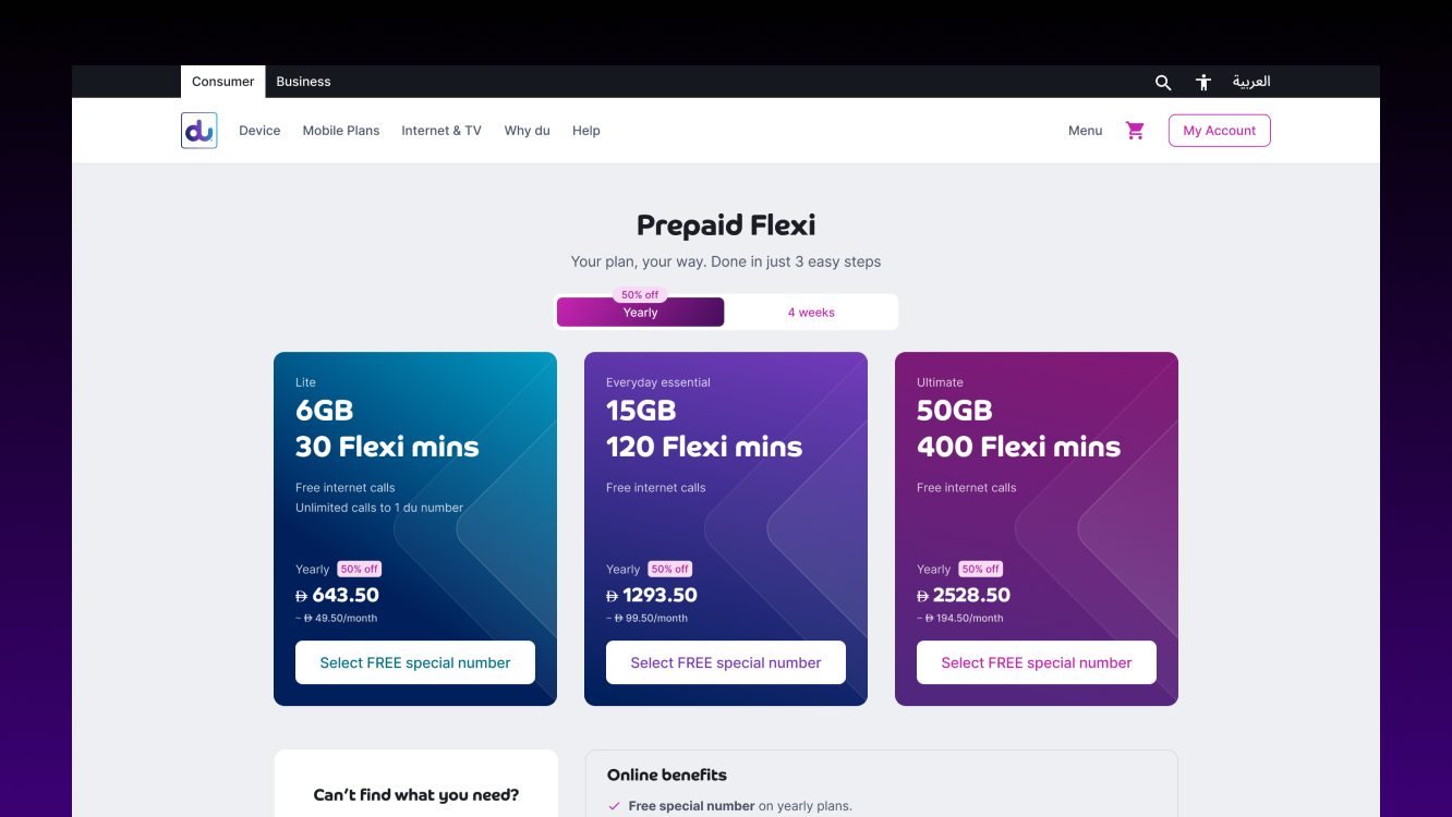
After stakeholder review and an internal usability test on prototypes, we shipped a hybrid lean toward Build my own. Plan Builder became the existing default option (made more intuitive and visual), and we introduced Subscription as a new alternative bundle entry, both reachable from a clear top-level choice. The unified approach gave users control without overwhelming them, while still letting us surface the strongest online-only offers contextually.
What actually shipped
The final design moved on five core principles I held throughout: transparency, simplicity, empowerment, trust, and conversion.
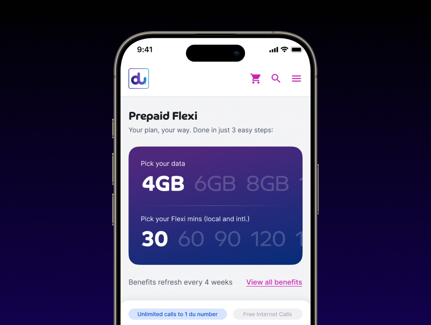
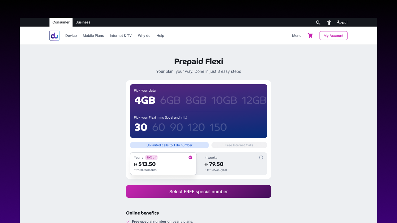
Transparency: Every page in the journey shows updated pricing and a clear breakdown of charges. Total monthly and yearly cost is always visible.
Simplicity: The journey was guided into a clean three-step process, with progress indicators and minimal cognitive load at each step.
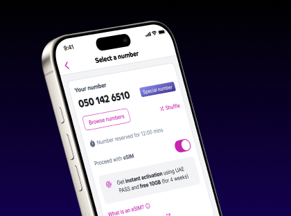
Empowerment: Customisation handled through sliders, toggles, and real-time updates. Users see their plan change as they build it, not at the end.
Trust: Upfront terms, visible value callouts (bonus, 50% off, special numbers), and a no-contract message reinforced across the journey.
Conversion: Sticky CTAs that don't intrude, urgency nudges where relevant ("Limited time bonus"), and a checkout designed to scale as new payment methods roll out.
Outcome
The revamp launched in stages after A/B testing key flows against the existing experience. Across early measurement windows:
Engagement lifted by approximately 40% across the redesigned journeys.
The new Subscription model contributed roughly 25% additional revenue beyond the existing Plan Builder.
Both flows now live in production at scale.
Beyond the numbers, the unified design system work meant most prepaid journeys could now be maintained against a single, evolving baseline rather than as separate flows. This was the quieter win, and the one I'm proudest of, because it makes everything that comes after this project faster and cheaper to ship.
Project gallery