Usage History
Designing a new way for du prepaid customers to see their usage, deductions, and wallet activity in one clear place.
Project overview
du prepaid customers had no way to see their usage. Not their data consumption, not call deductions from their wallet, not any loan amounts taken against future recharges. The information existed in backend systems but had never been exposed to customers in any usable way.
This created two problems. Customers were confused about where their money went and routinely called support to ask why their balance had dropped. And du was losing trust with users who couldn't see what they were paying for, the opposite of what a digital-first telco should be doing in 2025.
The brief was to design the entire feature from scratch: information architecture, categories, filters, edge cases, the lot. As a new requirement with no existing reference inside du, I had room to define what good looked like, and a responsibility to get it right the first time.
The problem
Three things made this harder than a standard "show me my data" screen.
First, the data was messy. Wallet deductions came from multiple sources: call charges, data usage, recharges, promotional credits, loans taken against future top-ups, refunds. Every category had different attributes and time-stamps. Showing it all in one feed would have been overwhelming.
Second, the audience was broad. Tourists buying short-term plans, daily wage workers tracking every dirham, and informed customers comparing usage month over month all needed different views of the same data.
Third, this was a trust feature, not a transactional one. Customers wouldn't come here to do something. They'd come here to verify, to question, to understand. The design had to be transparent and complete, because the moment something looked hidden or incomplete, the feature would create more support calls instead of fewer.
Research
Since this was a new feature for du, I started by studying how telecom operators around the world solve it. I audited ten operators across nine markets: Vodafone (Qatar and Australia), Jio and Airtel (India), Etisalat prepaid and postpaid (UAE), Virgin Mobile (UAE), Lyca and Lebara (UK and Netherlands), and Ooredoo (Oman).
What stood out wasn't any single design pattern, but the recurring failures. Most operators either dumped all categories into one timeline (overwhelming), buried filters two taps deep (frustrating), or surfaced raw data that only made sense if you already knew what you were looking at (unhelpful).
The strongest patterns I saw came from unexpected places:
- Jio's quick-actions block above the usage feed (set alerts, view detailed statement, helpful tips) gave users a sense of control before they even scanned the list.
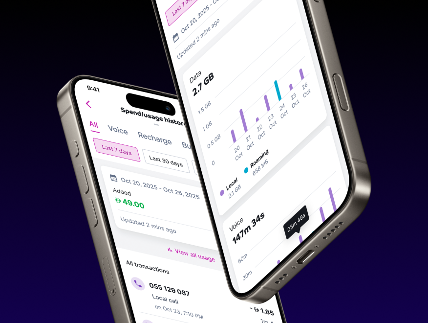
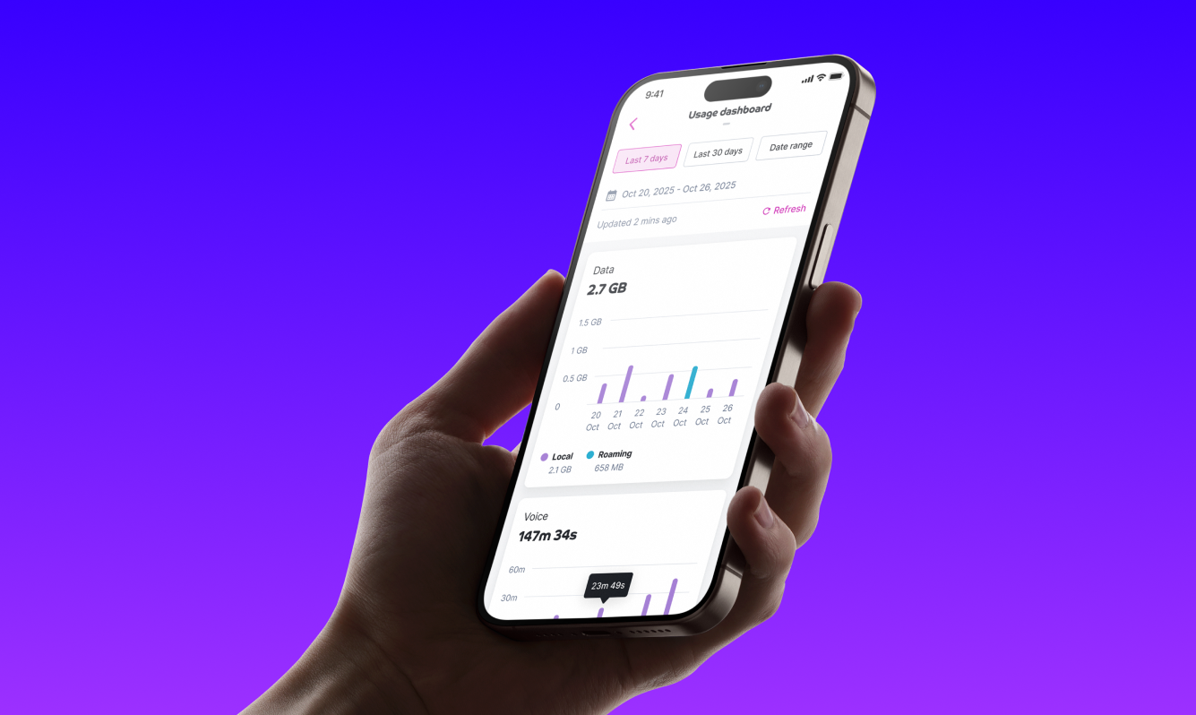
- Etisalat postpaid's visual bar chart with Days/Week/Month toggles made trend-reading effortless.
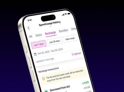
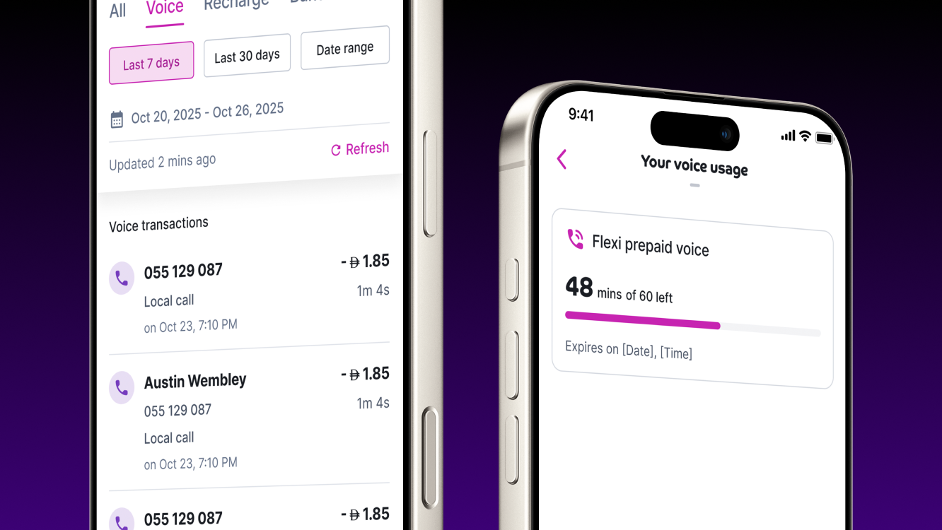
- Vodafone Qatar's tab-level split between Usage and Transaction stopped the two from contaminating each other.
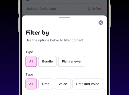
- Virgin Mobile's date-range chip system at the top (24h, 7d, 30d, Custom) was the cleanest filter UX I found.
- Ooredoo's empty-state messaging ("Dear user, in this specific period, there is no data to show. Thank you.") was warm and honest in a way I wanted to preserve.
What none of them did well was loan tracking and wallet-level transparency. That gap was du's opportunity.
Three directions, one decision
Based on the competitor patterns and user needs, I explored three structural directions
Direction 1 - Single feedOne chronological list of every event (usage, deduction, recharge, loan), filtered by category chips at the top. Closest to Jio's approach. Simple, scannable, but heavy on cognitive load when categories mixed.
Direction 2 - Tabbed sectionsSeparate tabs for Usage, Wallet Transactions, and Loans. Closest to Vodafone Qatar's split. Cleaner separation but required users to know which tab held what.
Direction 3 - Summary + drill-downA summary screen with category cards (Data, Voice, Wallet, Loans) showing recent totals, with each card opening into a detailed list. Closest to Vodafone Australia's pattern.
Direction 1 was the most familiar but failed the trust test. Mixing a 0.50 AED call charge with a 100 AED loan repayment in the same feed felt chaotic.
Direction 2 was clean but required users to make a navigation decision before they'd seen what was inside. For verify-and-go users, that was a tap too many.
Direction 3 won. The summary view gave verify-and-go users their answer immediately (each card showed the most recent transaction in that category), while trend trackers could drill into any category for the chart view and full history. Tourists could ignore Loans entirely. It served every user type without compromising the others.
The snapshot
Beyond the structure, several smaller decisions shaped the final experience.
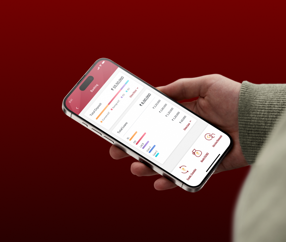
Wallet deductions sit alongside data and voice usage as a peer category, not buried inside a settings page. This was a deliberate trust move: if du is taking money out of a customer's wallet, they should see it as easily as they see their data consumption.
Loan tracking got its own category with a clear running balance. Customers who'd taken advance credit could see exactly what they owed, what they'd already repaid, and when the next deduction would happen. This was the single most-requested feature in the research, and the one no competitor handled well.
Time grouping uses relative labels (Today, Yesterday, This week, Earlier) rather than just dates. It's how humans actually think about recent activity, and it reduces the cognitive cost of scanning a list.
Outcomes
At time of writing, the feature is approaching launch and has already gone through extensive internal validation.
The prototype has been received strongly by the du operations and management teams, who flagged it as a meaningful step forward for prepaid self-care. The flows hold up against the real customer queries the operations team handles every day, with the prototype answering each type of query (balance drops, loan repayments, data usage, wallet deductions) cleanly without needing additional explainer screens.
Beyond stakeholder reception, the component library work that came out of this project has already paid forward. The transaction row, category card, and date-range chip patterns I built for Usage History have been picked up for use across Wallet, Recharge, and other self-care surfaces, giving du a more consistent foundation across the prepaid app.
The feature is expected to live in the production app shortly. Full impact metrics will follow post-launch.
Project gallery